Thursday, August 26, 2021

Taking Back Your Privacy – from ZoomInfo

By Tony Lee

Note:  I am not a lawyer, there are probably no laws broken here, and I am sure many will say that this is how the sales industry works. However I disagree with the way our data is being collected and sold. If you disagree as well, at least you can take it away from one organization that sells it.

Background

Recently, I was experiencing an uptick in cold calls * to my personal cell phone * from sales reps trying to pitch enterprise technology products. Please note that I understand that Business development (BD) / inside sales is a tough job and I don’t fault the reps themselves for doing their jobs. However, these calls to my cell phone were often occurring during dinner or even late into the evening when time should be spent with family. It was getting as bad as the car warranty calls and you know how frustrating those can become. After asking the last few reps where they received my cell phone number, they said that I was just a record in their SalesForce database and they thought it was an office desk phone. When I asked what fed their SalesForce database, they all said the same thing:  ZoomInfo.


What is ZoomInfo?

According to ZoomInfo, they create “profiles of business people and companies, which we call “Public Profiles,” from different sources. Once we have collected business information about a person or company, we combine multiple mentions of the same person or company into a Public Profile. The resulting directory of Public Profiles is then made available to the users of the site and our customers and strategic partners.”  Source:  https://www.zoominfo.com/b2b/faqs/data/how-does-zoominfo-get-my-info 


In short, ZoomInfo appears to source data from “publicly available” sites (and who knows where else), augments it with purchased data, and then sells that data to populate customer contact databases for sales purposes. I believe this is a serious privacy concern since this is not something that I opted into. And more importantly I certainly did not opt into receiving phone calls from numerous sales reps on my personal cell phone – yet it is happening and ZoomInfo is the distributor of my personal data.


How to tell if ZoomInfo has your data

The easiest way to see if ZoomInfo has your data is to go to Google and search for zoominfo, your name, followed by your company name as shown in the screenshot below.

Ex:  zoominfo <your name> <your company name>

Figure 1:  Searching for yourself in the ZoomInfo database

Then you can click on the Google search result to verify that it is you and see the click bait information that prompts organizations to pay to receive your data such as email address, direct phone number, HQ number, Company, and location -- possibly more.


Figure 2:  Public Profile View -- Click bait for you to purchase full access

As a bonus, if you are curious as to how much information ZoomInfo has about your organization, use this handy Google dork:

inurl:www.zoominfo.com/p/ "at <company name>"

For a bit of irony, let’s use a fantastic organization that may care about this activity for this example -- the Electronic Frontier Foundation (EFF).  “The leading nonprofit defending digital privacy, free speech, and innovation.”

inurl:www.zoominfo.com/p/ "at EFF"

The following result yields 60 hits of people that are currently at the EFF or previously worked at the EFF.  I blurred it out because I respect their privacy. Larger organizations yield thousands or hundreds of thousands of records.


Figure 3:  Google dork example using the EFF

Note that Google omits some results, but you can go to the last page of the Google Search and rerun the search with the omitted results included to see all of the records.

Removing your Information from ZoomInfo

Ok, so ZoomInfo built a public profile on you...  Thankfully, they do provide the ability to remove your information from their database and even notify others (to which they already sold your info) that you want to opt-out.  From what I have seen, the publicly displayed page removal is nearly instantaneous.  Kudos to ZoomInfo there.


Figure 4:  What your public profile looks like after it has been removed.

To start taking back your privacy, go to the following link:


Figure 5:  Info Removal Page

After inserting the email address that they have on file (partially displayed on your public ZoomInfo page), you will receive an email with a four digit code.  Enter the code and you are taken to the page to opt out.  There is a check box that says:  “I would like to delete and opt-out of the sale of my information.”  Check this box and also select the radio button to share the opt-out request with other data providers to let them know that you do not wish to have your data sold. That is a very nice option and I hope it works. Only time will tell. Submit the page and then double check your public profile which should now yield the 404 error. I am not sure how long that lasts before they start building another public profile.


Figure 6:  Opt-out page with options

Conclusion

While the business model that ZoomInfo uses is most likely legal, this model contributes to the erosion of digital privacy. I don't appreciate companies selling my information which results in unwanted cold calls and extra spam. If you don't like it either, at least now you have the ability to confirm it is happening and take back your privacy -- one database entry at a time if that is what it takes.

Thursday, October 15, 2020

VirusTotal Lookups in Microsoft Power BI - Processing JSON

 By Tony Lee

So we are on this Power BI binge... and figured a VirusTotal lookup report and dashboard would be useful as a stand alone tool as well as a drill through fed by other reports. Presented below are the results of our efforts, steps we took, and limitations we encountered (as newbz). In typical form, we released the work for free so everyone can use, contribute, and modify as they see fit.  Enjoy!:

https://github.com/TonyLeeVT/VirusTotal-PowerBI-Lookup/

Figure 1:  Resulting VT Lookup report in Power BI

Features

Let's start with what this report provides -- from top left to bottom right:

  • Slicer (filter) to filter on engines that hit or missed the sample
  • Permalink to the results
  • Gauge to indicate number of hits vs engines
  • Verbose message from VT
  • What Resource we actually queried
  • MD5, SHA1, and SHA256 hash values
  • Table of engines, conviction results, malware classification, engine update, and engine version
  • Treemap of conviction results - useful for determining the highest malware family consensus

Process

At a high-level, here is what we did to create the dashboard:

  1. Created a parameter that holds the Resource we want to look up
  2. Used "Get Data" to query the VT API to pull in the JSON response
  3. Used Power Query Editor to manipulate and extract the nested JSON as needed
  4. Built a cool dashboard in Power BI Desktop
Since there are some intricate details in processing JSON data, we figured we would break down the steps in a bit more detail.

Creating the Parameter


We created two parameters to prompt users for data.  The first is the VT API key and the second is the hash they want to query.  Parameters are created in Power Query Editor by clicking on the down arrow for Manager Parameters > New Parameter

Name the field, Add a description, select Text for the Type, and enter a hash you know VT has for the Current Value.  In our example, we used the hash:  0a52fdc2219346d25295c8d6838122bcdd7ddf119386cd1030458b035cd97999


Figure 2:  Creating and managing the parameter that stores the query value

Note:  We also created a parameter for the API key so the user is prompted for the key when opening the Power BI template for the first time. When this is saved as a .pbix, the parameter value is also saved making it easy to use by the team.

Creating the VirusTotal Web API call for Get Data

To create the Web API call perform the following:
  • Get Data > Web
  • Advanced
  • URL parts:
    • https://www.virustotal.com/vtapi/v2/file/report?
    • apikey=
    • Select Parameter from the dropdown and use API_Key
      • Note:  The free VT API key can be used
    • &resource=
    • Select Parameter from dropdown and use "Resource"

Figure 3:  Creating API call to VirusTotal to get the JSON data

Note:  The data returned will be JSON.  Now we need to make it columnar.


Use Power Query Editor to Manipulate the JSON

When the JSON formatted data is returned from the VirusTotal API query, follow these steps to make it columnar:

Convert > Into Table

Figure 4:  Convert JSON to a table


Transform > Transpose > Use First Row as Headers

Figure 5:  Transposed the table and then used the first row as the header


Take note!  The field called scans has a value of: "Record".  When clicking on this object, it expands below revealing the results of each scan vendor. Notice that those values are also "Record" which means we have two nested JSON objects, one inside the other.  We will need to make both columnar data to use it in Power BI.

Figure 6:  The scans field is a JSON object that contains more JSON objects

Expand the scans column

Here is a trick that we learned from a Guy in a Cube video -- thanks for the videos fellas! There is a little double arrow box in the far right portion of the header for scans. If you click this, it will allow you to expand (convert) the JSON to columnar data once again.  Be sure to uncheck the box at the bottom to avoid prepending a prefix that we would strip away later.

Figure 7:  First expansion of JSON object called "scans"

Highlight the antivirus vendor columns > Unpivot Columns

Figure 8:  Unpivoting the antivirus vendor columns to make each entry its own row


Rename Attribute field to Engine

Expand the Value field that contains more nested JSON

Figure 9:  Renaming column header and expanding second JSON object


Rename new columns to remove "Value." in front of detected, version, result, and update.

Building the dashboard

The dashboard consists of a filter, some tables, a gauge, and a treemap. Please see our other Power BI articles on building visualizations. The toughest portion of this task was taking JSON input and making it columnar so it can be processed by Power BI. As a bonus, we are also templating this project and making it available to everyone.

Template

As we just mentioned, we saved this work as a template and will distribute it for free. When opening the template, simply insert your VT API Key (which can be the free API key) and the hash that you want to query (called a resource).

Figure 10:  Templated VirusTotal lookup report in Power BI


Limitations

Currently we believe we have the following limitations, but these may be easy to overcome depending on how many ideas and solutions we can pull from our readers:
  1. Unable to modify hash parameter from report / dashboard to refresh data feed with new data natively from Power BI
  2. Drill through lookup using hash from previous report may be limited due to parameter update issue
  3. Potential for AV column rename to fail due to hard coded AV vendor names in power query
  4. Error handling could be improved for instances where VirusTotal does not have the data
    • "response_code": 0 vs. "response_code": 1

Conclusion

We hope you enjoyed this article and have some ideas for us to correct some of the limitations. Feel free to contribute ideas and help us make this report better by using the comments feature below or submitting pull requests via Github. Or just give us a shout out if you are using this solution.  Enjoy!

Thursday, October 8, 2020

Fun with Microsoft Power BI - Part IV - Improving Workflow

  By Tony Lee

Welcome to part IV in this series of going from zero to hero using Power BI to ingest, process, and make amazing reports.  If you have read some of our other articles you can probably tell by now that we enjoy making data actionable. Honestly, it doesn't matter what type of data or even where the data ends up. As long as we can make informed decisions using the data -- we love it. Following in this theme we are going to make BlackBerry (formerly known as Cylance) Protect Threat Data Report (TDR) CSVs actionable using Power BI and Power BI Desktop. You can use any data source to follow along in this series, but our example BlackBerry Protect report is shown below which we are happily sharing the Power BI template (.pbit) at the github link below so you can load and analyze your own data!

https://github.com/TonyLeeVT/BlackBerryProtectTDR-PowerBIViewer


Figure 1:  Our Policy Explorer Power BI report using BlackBerry Protect TDR data

In the first article, we covered:

  • Getting Started
  • Data Ingest
  • Adjusting Fields
  • Visualizations
  • Saving Your Work
In the second article, we covered:
  • Tabs
  • More Visualizations
    • Text box
    • Slicer
    • Table
    • Pie Charts
    • Treemap
  • Using Reports and Dashboards
  • Uploading Reports to Power BI Service (Online)
In the third article, we covered:
  • Question and Answer (Q&A) Feature
  • Power BI for Mobile
  • Changing the Data Source
  • Scheduling Data Refresh
In this article, we will cover:
  • Matrix and Decomposition Visualizations
  • Inserting Images with Actions
  • Tooltips
  • Parameters
  • Power BI Templates

Matrix and Decomposition Visualizations

We just wanted to give a shout out to two very cool visualizations that help with analyst workflow. The first being the matrix visualization which allows you to hierarchically dig into data by expanding rows or columns.  To create the Matrix, we used Policy Name, Section, and Key as the Row value + Last Value as the Values. 

Figure 2:  Interactive matrix of policy configurations


The second visualization is Decomposition which allows you to visually analyze large amounts of data by viewing and summing common values.  To create the Decomposition, we use the distinct count of Policy Name for the Analyze field and Explaining by the Section, Key, and Value.

Figure 3:  Interactive decomposition visualization of policy configurations

Both of these visualizations ended up being perfect for our Policy Explorer Report shown as the first image in this article. Note: This test environment has more policies than what is typically found in large and complex environments, but it further proves that this solution scales.

Inserting Images with Actions

This feature may seem like a no-brainer, but it can really spice up a report. You can add images/logos and assign actions to them by going to Insert > Image > selecting the image. With the image selected, enable action and select type. In the example shown below, we chose a type of Web URL and added a link back to the BlackBerry website.

Figure 4:  Inserting the BlackBerry logo and creating a hyperlink back to the product page


Tooltips

The best way to describe a tooltip is the ability to add additional context to data via a simple action of hovering over an item in a report. In our screenshot below, we used an example of getting host information context by hovering over an event. This prevents us from having to dig into a completely separate table of devices data to discover information about the host in that event. The information displayed in the popup is quite powerful since it includes:  Operating system, Agent version, MAC address, Policy name, IP address, and more.

To enable this, we performed the following high-level steps:
  • Created a new page via the tabs at the bottom
  • Hid that page from view
  • Changed the page size and type to Tooltip
  • Created the multi-row card with our host data
  • Set the Tooltip field to be Serial Number (which is common to Devices and Events)

Figure 5: Powerful tooltip created by using data from related data feed

Parameters

In the process of getting ready to convert our work to a Power BI template to share with the community, we converted our BlackBerry Protect Threat Data Report data sources to use a parameter for the TDR token. This allows the user to change a single field (ex: TDR Token) and pull data from a different tenant. As a bonus, when a user opens our Power BI template, Power BI prompts the user to enter their TDR token to pull down data from the BlackBerry TDR API and populate the reports. Then when the report is scheduled for updates (as covered in part III of our series), all of the required information is already included to access the data and update the reports.

Figure 6:  Token parameter used to make these data feeds easily configurable for each customer's token

Power BI Templates

This is the topic most have probably been waiting for because it means that we are going to share the BlackBerry Protect report we have been building to explore Power BI.

Creating a template (.pbit) is super easy in Power BI Desktop.  Simply perform the following:

File > Export > Power BI template

Now, when you download our Power BI Template, you simply enter the TDR token from your BlackBerry protect console (Settings > Application > Threat Data Report) and it will start downloading the information.

Figure 7:  Entering the TDR parameter after opening the Power BI Template

Conclusion

This brings us to the end of our series on Fun with Microsoft Power BI (using our BlackBerry Protect example). We hope you enjoyed the topic and learned something new. Please feel free to leave any pro-tips or questions in the comment section below. As a bonus, if you are a BlackBerry Protect customer, please feel free to download our template, enter your TDR token and check out the visualizations. Let us know what you think--thanks for reading!


Monday, October 5, 2020

Fun with Microsoft Power BI - Part III - Advanced Ingest and Viewing

 By Tony Lee

Welcome to part III in this series of going from zero to hero using Power BI to ingest, process, and make amazing reports. If you have read some of our other articles you can probably tell by now that we enjoy making data actionable. Honestly, it doesn't matter what type of data or even where the data ends up. As long as we can make informed decisions using the data -- we love it. Following in this theme we are going to make BlackBerry (formerly known as Cylance) Protect Threat Data Report (TDR) CSVs actionable using Power BI and Power BI Desktop. You can use any data source to follow along in this series, but our example BlackBerry Protect report is shown below which we will happily share the Power BI file at the end of the series for you to load and analyze your own data, so stay tuned for that!

Figure 1:  Our Power BI report using BlackBerry Protect TDR data

In the first article, we covered:

  • Getting Started
  • Data Ingest
  • Adjusting Fields
  • Visualizations
  • Saving Your Work
In the second article, we covered:
  • Tabs
  • More Visualizations
    • Text box
    • Slicer
    • Table
    • Pie Charts
    • Treemap
  • Using Reports and Dashboards
  • Uploading Reports to Power BI Service (Online)
In this article, we will cover:
  • Question and Answer (Q&A) Feature
  • Power BI for Mobile
  • Changing the Data Source
  • Scheduling Data Refresh

Question and Answer (Q&A) Feature

Ever wish you could use natural language to ask questions and get answers about your data? In Power BI, you can do just that and even save the resulting visualizations into your report (if you have the necessary permissions). It may take a bit of trial and error, but the results can be both interesting and useful. In Power BI Desktop, this is activated by going to Insert menu > Q&A. In the Power BI Service online interface, click on the report you want and then the "Ask a question" button.

Figure 2: Question and Answer feature of Power BI

Power BI is nice enough to suggest a few questions to ask, however we will list some of our questions below as well.

Example searches include:
  • most recent threats data report
  • count of threats data reports by create time
  • show classification by sha 256, file name as matrix
Figure 3:  Example Q&A


Power BI for Mobile

One of the best features of Power BI is the platform flexibility. Once you build a report and have it available in your workspace, you can view it on nearly any mobile device: Apple, Android, and Microsoft.


We have an Android phone that we used to view the report and try out the filters. The app is available in the play store: https://play.google.com/store/apps/details?id=com.microsoft.powerbim&hl=en_US

 
Figure 4:  Screenshot of our report displayed on a Galaxy Note 8

Changing the Data Source

In our first article, we wanted to keep things simple by uploading a static CSV file. This is great for building the initial report, but it becomes cumbersome to update the data. Fortunately for us, this CSV data came from a simple to use web API which Power BI can easily handle. In fact, Power BI supports a ton of data ingest options such as files, databases, cloud services (over 60 of them!), web APIs, and more. Now let's change our data source from static CSV file to web API, but first let's check the timestamp on the imported file. This can be achieved by hovering over the ThreatsDataReport field.

Figure 5:  Determining staleness and freshness of data


There is an option to refresh the data, but because the original data source is a static CSV, we would need to manually download it again. To change the data source, we need to Edit the query.

Figure 6:  Edit the query to change the source from static file to web query

This opens Power Query Editor. Next we click, Data source settings > Change Source... > Advanced > Then we use the file path parts to first enter the URL and then enter the token on the second line. This file will open the exact same as the static file.

Figure 7:  Changing the data source to using web API

Now that the source is changed to use the web API, we can refresh the data with a click of the button in Power BI using "Refresh data". After checking the timestamp on the new data, the update was successful!

Figure 8:  Refreshing data via the web API


Scheduling Data Refresh

Taking reporting one step beyond a manual refresh, we can also schedule a refresh of the data. In Power BI Service, expand the workspaces to see the Datasets. Click on the three dots next to the Web API data feed and select "Schedule refresh".

Figure 9:  Scheduling a refresh

Under the Schedule refresh menu, turn it on, enter the frequency and even the time to refresh. Another nice touch in this feature is email notification of failure.

Figure 10:  Settings for scheduling a daily data refresh


Conclusion

In this article, we looked at some interesting and more advanced features in Power BI to include the natural language Q&A feature, viewing reports on the Power BI mobile app, converting our static CSV file to update via web API, and finally scheduling the web API dataset to automatically update every day. Power BI is full of features and hopefully you learned something new today. Please feel free to leave feedback and your favorite Power BI features in the comments section below.


Thursday, October 1, 2020

Fun with Microsoft Power BI - Part II - Reporting

By Tony Lee

Welcome to part II in this series of going from zero to hero using Power BI to ingest, process, and make amazing reports.  If you have read some of our other articles you can probably tell by now that we enjoy making data actionable. Honestly, it doesn't matter what type of data or even where the data ends up. As long as we can make informed decisions using the data -- we love it. Following in this theme we are going to make BlackBerry (formerly known as Cylance) Protect Threat Data Report (TDR) CSVs actionable using Power BI and Power BI Desktop. You can use any data source to follow along in this series, but our example BlackBerry Protect report is shown below which we will happily share the Power BI file at the end of the series for you to load and analyze your own data, so stay tuned for that!

Figure 1:  Our Power BI report using BlackBerry Protect TDR data

In the first article, we covered:

  • Getting Started
  • Data Ingest
  • Adjusting Fields
  • Visualizations
  • Saving Your Work
In this article, we will cover:
  • Tabs
  • More Visualizations
    • Text box
    • Slicer
    • Table
    • Pie Charts
    • Treemap
  • Using Reports and Dashboards
  • Uploading Reports to Power BI Service (Online)

Tabs

Just a quick note for folks that are familiar with excel tabs. In Power BI, they work much the same. Since the canvas size is somewhat fixed in size, tabs might come in handy for building multiple reports and overcoming canvas limitations.

Figure 2: Shows boundaries and tabs


More Visualizations

In the first article, we showed you how to add an event count, which essentially counted the number of rows in our BlackBerry Protect Threat Data Report. We started off with an easy visualization and will progress to more difficult ones.

Text box

We are fans of being able to quickly glance at a dashboard and know what it is...  thus a simple text box at the top is a great way to accomplish this task.  Insert > Text Box.  Then get fancy fancy with the background color and font. We will get even fancier in a later article using images with hyperlinks, but let's crawl, walk, then fly.


Slicer

We are also fans of being able to interact with the data by carving and drilling down into interesting events. For this, we use a slicer (Power BI term), also known as a filter to the rest of the world. ;-) In our BlackBerry Protect example, we are filtering on multiple fields using a checkbox in most cases. To do this, simply click in the canvas, click on the slicer icon, drag the field you want to filter on, and bob's your uncle. 

Figure 3:  Check box filters (aka slicers)

You may have also noticed that we have a time range selector in our report. This is also a slicer, but we dragged a time field into the field box and Power BI is smart enough to convert it from a check box to a time range selector. For our example, we used the "Create Time" field for the malware. Note that there are additional options that specify how the time range selector behaves. Those are configurable by using the down arrow. Our preference for this scenario is "Relative Date" which allows you to specify a relative time range such as:  Last, Next, or This: X days, weeks, months, and years.

Figure 4:  Configuring how the time range selector works


Table

Tables are fairly straight forward to use as well. To use, simply click on the canvas > click the table icon > Drag the fields you want in the table.  The down arrow allows you to correct the order of appearance if necessary by moving the field up and down the list or you can drag the box up or down in the list.


Doughnut and Pie Charts

We saved doughnut and pie charts to later in this article because it is not as straight forward to create it depending on your data set. We used a doughnut chart in our example for "File Status" and "Detected By". The problem with these fields is that the data source does not provide the statistical breakdown (percentage per file status or what detected the malware). That must be calculated and Power BI may or may not do that automagically. For this, it helps to know a little bit of DAX to create measures. Per Microsoft:

"Data Analysis Expressions (DAX) is a library of functions and operators that can be combined to build formulas and expressions in Power BI, Analysis Services, and Power Pivot in Excel data models."

"Measures are dynamic calculation formulas where the results change depending on context. Measures are used in reporting that support combining and filtering model data by using multiple attributes such as a Power BI report or Excel PivotTable or PivotChart. Measures are created by using the DAX formula bar in the model designer."


These formulas are heavily dependent upon functions and there are a lot of them. A good reference is found here: https://docs.microsoft.com/en-us/dax/dax-function-reference

As an example... say you had a column called "Sales Amount" and you wanted to sum that and store it in a measure called "Total Sales".  The DAX for that would look like the following:

Total Sales = SUM([Sales Amount])

Now that we have a bit more understanding, we will create the "File Status" doughnut chart. To do this, we went to the Modeling menu > New measure > and enter:

File Status Stats = DIVIDE(count('ThreatsDataReport'[File Status]),CALCULATE(count('ThreatsDataReport'[File Status]),ALLSELECTED(('ThreatsDataReport'))))

Note:
  • ThreatsDataReport is our table, the entries in the brackets [] are the columns
  • ALLSELECTED is so our slicers (filters) still work when selected
Once we click the checkmark, we should have a new field called "File Status Stats".  We will click the canvas, click the pie or doughnut chart icon, and drag the "File Status Stats" field to the Values box in visualization and we will drag "File Status" to the Legend box.

Figure 5:  Creating a measure and a doughnut chart in Power BI

Doughnut and Pie Charts - Cont.

Note: After some trial and error, we discovered a potentially easier way to create doughnuts and pie charts showing top values. Select either pie or doughnut chart and drag the field into the Legend box and drag the same field into the Values box and make sure Count is selected for Values. This creates the same pie and doughnut chart as our DAX fanciness above.

Pro-tip:  You can now change this visualization to a table to show an easy to read statistical breakdown (Top or Rare).

Figure 6:  Create a pie or doughnut chart while avoiding DAX

Treemap

Fortunately, creating a treemap is similar to creating a doughnut or pie chart. Once you have the DAX (or logic) created, it is all downhill from there. In our example, the malware classification data made an awesome treemap visualization. For this treemap, you can either drag the same field twice (with Value as a Count) as we showed in the example above, or you can use DAX for the calculation.

Our DAX to calculate the classification stats measure:

Classification Stats = DIVIDE(count('ThreatsDataReport'[Classification]),CALCULATE(count('ThreatsDataReport'[Classification]),ALLSELECTED(('ThreatsDataReport'))))

To create the treemap, click the canvas, then the treemap icon, drag the "Classification" field to the Group box, and the "Classification Stats" field to the Values box.

Figure 7:  Creating a treemap using the malware classifications

Note: Most visualizations apply a filter when clicked. Not all of them are very intuitive in how to clear the filter. For the treemap, either click the box you already clicked or click the top left box to clear the filter.

Using Reports and Dashboards

Now that you have a report built, you can use it as-is in Power BI Desktop. The slicers function to carve up the data as needed, however there is no presentation view or mode. Thus your presentation to others will not look as polished as it could. To get around this problem, we can take the .pbix file and upload it (or publish it) to a personal workspace in Power BI Service where you can use it as individual reports or pin visualizations from multiple reports to make a dashboard.

Uploading Reports to Power BI Service (Online)

Upfront warning:  Be careful publishing the work since the .pbix contains your data set as well and could potentially leak information.

Keep in mind that there are multiple methods to load a local Power BI Desktop file into the online service. You can use the Publish button in Power BI Desktop or you can log in to your Power BI account:  https://powerbi.microsoft.com/en-us/landing/signin/
Click "My Workspace" > "Get Data" > "Local File" > navigate to your .pbix file

Figure 8:  Uploaded .pbix to Power BI Service workspace


This should now be in your personal workspace and you can view the report via your web browser. To enter a full screen presentation mode, click the double arrow in the top right corner of the window.

Figure 9:  Entering full screen presentation mode


Conclusion

In part II of our series we covered how to use tabs and many more visualizations--including some that are not so straight forward. We only scratched the surface of DAX since that could be a blog series unto itself. But we also discovered the presentation limitation in Power BI Desktop and how to over come that presentation by using the Power BI Service. We hope that you are now able to take data, ingest it, create a report, and present that report in a professional setting. Our future articles will focus on improving the usefulness and functionality of carving and displaying data using Power BI. Please feel free to leave feedback and your favorite Power BI features in the comments section below. Stay tuned for more great Power BI info!

Monday, September 28, 2020

Fun with Microsoft Power BI - Part I - Intro

 By Tony Lee

If you have read some of our other articles you can probably tell by now that we enjoy making data actionable. Honestly, it doesn't matter what type of data or even where the data ends up. As long as we can make informed decisions using the data -- we love it. Following in this theme we are going to make BlackBerry (formerly known as Cylance) Protect Threat Data Report (TDR) CSVs actionable using Power BI and Power BI Desktop. Sure, we could have used excel and some charts here and there, but Power BI is a more suitable fit to creating reusable, decision maker ready, reports. You can use any data source to follow along in this series, but our example BlackBerry Protect report is shown below which we will happily share the Power BI file at the end of the series for you to load and analyze your own data, so stay tuned for that!

Figure 1:  Our Power BI report using BlackBerry Protect TDR data

In this first article, we will cover:

  • Getting Started
  • Data Ingest
  • Adjusting Fields
  • Visualizations
  • Saving Your Work

Getting Started

There are many options for using Microsoft's Power BI which are associated with varying costs and features.  As a high-level overview:

  • Power BI Desktop - Free thick client which can be used to ingest data and design reports
  • Power BI Pro - $9.99 monthly per user pricing (included in E5 license)
  • Power BI Premium - $4,995 monthly pricing - Enterprise BI big data analytics
  • Power BI Mobile - iOS, Android, HoloLens, PC, Mobile Device, Hub apps
  • Power BI Embedded - Analytics and visualizations tailored for embedded applications
  • Power BI Report Server - On-premises reporting solution, included in premium and can provide hybrid on-prem and cloud capabilities

Source:  https://powerbi.microsoft.com/en-us/pricing/

For our learning purposes we used Power BI Desktop to develop our report and Power BI (https://powerbi.microsoft.com) to display it (full screen) in our private workspace. We appear to be using a "free" cloud account and did not upgrade to Pro.

Note:  You cannot use a personal account to sign into Power BI.  You must use a work or school account.  Chances are you probably have one of these accounts and it has some (even free) access to Power BI.

Figure 2:  Power BI ecosystem - Source:  https://docs.microsoft.com/en-us/learn/modules/get-started-with-power-bi/1-introduction


Data Ingest

Now that you have downloaded Power BI Desktop, we need to ingest data. As mentioned at the start of the article, we are using BlackBerry Protect TDR data which is downloaded from the BlackBerry/Cylance portal in a CSV format. Once the data set is downloaded, in Power BI Desktop, click Home > Get Data > Text/CSV and navigate to the file.

Figure 3:  Many options for loading data

Power BI Desktop did a great job parsing the data in columns with the appropriate header. It even tries to detect the type of data such as string vs. number vs. date.

Figure 4:  Parsing of fields

Adjusting Fields

You should now see the fields on the right hand side of the canvas. Note that there may be some instances in which Power BI takes the liberty in summarizing your data--sometimes this is helpful and something it does not make sense to humans. This is understandable since it still takes a human to determine the context around various data fields. A good example is provided when Power BI Desktop tried to sum the BlackBerry/Cylance Protect scores which is of no real value to analysts.  "A" for effort though and at least it is correctable by clicking on the parsed field on the right > Column tools > Summarization > Don't summarize. 

Figure 5:  Adjusting the parsed fields

Don't worry about trying to find all of the misinterpreted data up front. You will discover some of these as we start creating visualizations in our report.

Note:  Power BI prefers Columnar data, thus spreadsheets that are appealing to the human eye are not always interpreted correctly by Power BI. This level of transforming and manipulating will be left to another article.

Visualizations

What may be most impressive about Power BI is the amount of visualizations available by default. These include (but are not limited to):

  • Area charts
  • Bar and column charts
  • Cards (numeric value)
  • Combo charts
  • Doughnut charts
  • Funnel charts
  • Guage charts
  • Key influencers chart
  • KPIs
  • Line charts
  • Maps (ArcGIS, filled choropleth, and shape)
  • Pie charts
  • Ribbon charts
  • Treemaps
Figure 6:  Visualization options


And the list goes on...  

To start with a simple visualization, let's create a card with the total number of events (in this case it will correlate to the number of rows we have... each row in our data always contains a DeviceName). Begin by clicking anywhere in the canvas and then click the card icon under visualizations. Drag the field you want to count to the Fields box under Visualizations (in our case it was DeviceName). Then click the down arrow and select Count. There are lots of formatting options by clicking on the paint roller under visualizations. We encourage you to explore those settings to achieve your desired look. 

Figure 7:  Created our first visualization - a card that contains the count of events

Saving Your Work

Now that you have ingested, parsed, and created your first visualization in your report, it is time to save it. Click File > Save As > Name the file. Notice that the file extension is .pbix. Feel free to close Power BI Desktop, re-open your file, and also notice that the data is still there. This indicates that the data is self-contained within the .pbix file -- keep this in mind where sharing your .pbix files with others.


Conclusion

In this article, we showed the different options for downloading and using Power BI. Specifically downloading Power BI Desktop and ingesting BlackBerry (Cylance) Protect Threat Data Report data which is in CSV format. Power BI Desktop parsed the data and we showed one potential alteration to the way the data was interpreted. Lastly, we rounded out the article showing how to create your first visualization and save your report locally as a .pbix file. Our follow-on articles will cover more advanced visualizations, relationships, filters, using reports, and uploading reports to Power BI Service (online). Thanks for reading, we hope you enjoyed this introduction to Microsoft's Power BI. Please feel free to leave feedback and your favorite Power BI features in the comments section below.

Tuesday, September 1, 2020

Testing Logstash Data Ingest

 By Tony Lee

When setting up an Elasticsearch Logstash Kibana (ELK) stack, you may discover the need to test your Logstash filters. There are probably many ways to accomplish this task, but we will cover some techniques and potential pitfalls in this article. 

Note: This article can be used to simulate any syslog replay for manual data ingest testing, but our example specifically covers Logstash as the receiver and a fabricated, but realistic, event.

Real-time Visibility

The first thing that will aid us in this ingest testing is real-time feedback. This could come from at least two potential places:

1)  "Real-time" discovery search within the Kibana UI

This is accomplished by using the discovery dashboard, setting a search term you know to be in your test message, and a short refresh rate as shown in the screenshot below.

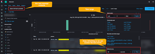
Figure 1:  Kibana "Real-time" search using refresh interval


2) Monitoring the logstash log file for warnings or errors

For this, we will use the tail command with the follow option (-f) to watch it in real-time.  The location of your Logstash log may differ so adjust the path as necessary.

tail -f /var/log/logstash/logstash-plain.log

We are looking for clues that may have prevented proper ingest such as:

[2020-08-31T20:25:21,997][WARN ][logstash.filters.mutate][main][b14e-snip-a422] Exception caught while applying mutate filter {:exception=>"Could not set field 'name' on object 'compute-this' to value 'see-this'.This is probably due to trying to set a field like [foo][bar] = someValuewhen [foo] is not either a map or a string"}


Encrypted or Unencrypted Listener

Once we have real-time visibility in place, we need to determine if the listening port is expecting encrypted data since this will determine how we replay traffic to it. There are a few ways to determine this:

1) Check the logstash filter config file

The example below, is an example of an encrypted port.  We can see that is the case because we are defining the SSL information and have ssl_enable set to true.

input {

  tcp {

    port => 6514

    ssl_enable => true

    ssl_cert => "/etc/logstash/logstash.crt"

    ssl_key => "/etc/logstash/logstash.key"

    ssl_verify => false

  }

}


2) Check the logstash logs for SSL errors

If you have an encrypted listener and you send data using an unencrypted transport method (such as telnet), you will see SSL errors such as the following:

[2020-09-01T13:46:20,758][ERROR][logstash.inputs.tcp][main][359d9-snip-c5038d] Error in Netty pipeline: io.netty.handler.codec.DecoderException: javax.net.ssl.SSLHandshakeException: error:100000f7:SSL routines:OPENSSL_internal:WRONG_VERSION_NUMBER


3) Use a tool (such as openssl) to verify the SSL connection

Below is an example of checking the SSL connection using openssl, but other tools can be used.

openssl s_client -connect <logstash_host>:6514

If the listener is expected encrypted data, you will see details such as certificate subject, issuer, cipher suites and more.

--snip--

subject=C = AU, ST = Some-State, O = Internet Widgits Pty Ltd

issuer=C = AU, ST = Some-State, O = Internet Widgits Pty Ltd

--snip--

SSL handshake has read 1392 bytes and written 437 bytes

Verification error: self signed certificate

--snip--


Methods of Replay

Now that we have real-time visibility and we know if the listener is expecting encrypted data or not, we can look at different techniques to replay the traffic. We will start with unencrypted methods first because we can later tunnel the unencrypted data to an encrypted listener. We will also examine replaying an entire packet (including the header) vs. replaying just the data and having the header added.

1) Unencrypted replay of an exact packet (Included specified time and no addition of a header)

If you have example logs that you can expect that include the date/time format, you can replay the exact message using netcat/ncat.  Keep in mind that you are most likely sending a static time, so you will need set your Kibana time range appropriately.

First, place the contents of your event in a test file, we created a file called testevent.txt with the following contents (notice the included date and time):

<46>1 2020-08-31T02:08:08.988000Z sysloghost ExtraField - - [Location] Event Type: OurTest, Event Name: Blocked, Device Name: DESKTOPTESTLOGGER2, File Path: C:\Windows\system32\foo.ps1,  Interpreter: Powershell, Interpreter Version: 10.0.18362.1 (WinBuild.160101.0800), User Name: SYSTEM, Device Id: 4eaf3350a984


Second, use netcat or ncat to send the data to your listening port. The example shown below is sending to an unencrypted listener (be sure to replace logstash_host with the IP or hostname of your logstash server):

ncat <logstash_host> 6514 < testevent.txt

Then just monitor the logstash log and real-time search in Kibana to see the event and/or potential errors.

2) Encrypted replay of an exact packet (Included specified time and no addition of a header)

For this we will use the same testevent.txt file from above and nearly the same command, but we will add --ssl to force ncat to perform the encrypted handshake.

ncat --ssl <logstash_host> 6514 < testevent.txt


3) Unencrypted replay of an exact packet contents with an updated time

If you have packet contents, but want the header updated with the current time, you might be able to use the logger command in Linux.  The trick here is to get logger to reproduce your expected header. Use the following steps to attempt this:

Understand the logger options:

logger --help


Read in our test event and output to stderr for troubleshooting:

logger -s -f testevent.txt


Use logger options to alter the header (in our case, it was --rfc5424=notq) to match what we need and then create a new file with only the content and no header.  Ex:  testevent_noheader.txt

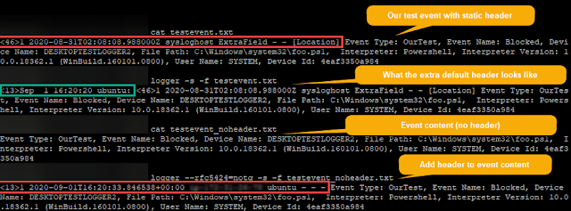
Figure 2:  Reproducing the event with an updated header

Send the event to the unencrypted listener and check for it in Kibana and Logstash logs:

logger --rfc5424=notq -s -f testevent_noheader.txt --server <logstash_host> --tcp --port 6515


4) Encrypted replay of an exact packet contents with an updated time

Unfortunately our version of logger does not have an option to enable encryption. So, if you were able to get logger to reproduce the header + content in the step above, but need to send it to an encrypted listener, you could once again use ncat to assist. The following command creates an unencrypted listener on your local host on port 6515--then anything written to that local port will be sent on in an encrypted state to port 6514.

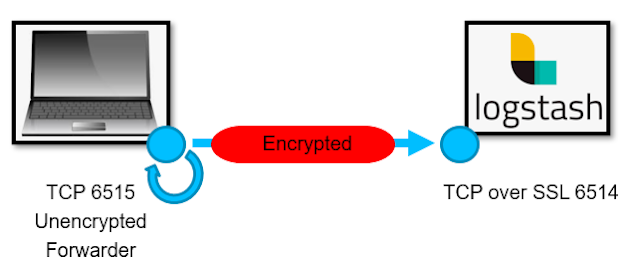
Figure 3:  ncat listener to send data onto Logstash using SSL


Step 1) Create the listening wrapper:

ncat -l 6515 -c "ncat --ssl <logstash_host> 6514"


Step 2)  Send the packet to the wrapper using logger:

logger --rfc5424=notq -s -f testevent_noheader.txt --server localhost --tcp --port 6515


Conclusion

We are just scratching the surface in ways to test data ingest components such as Logstash. For instance, this could be expanded to include scripting with variables that are replaced with random data to generate more robust values. But that will be an exercise left to the user (or maybe a future article). We do hope this article proved useful and would love to know what you use for testing data ingest. Feel free to leave comments in the section below.  Thanks for reading.