Showing posts with label report. Show all posts

Thursday, October 15, 2020

VirusTotal Lookups in Microsoft Power BI - Processing JSON

 By Tony Lee

So we are on this Power BI binge... and figured a VirusTotal lookup report and dashboard would be useful as a stand alone tool as well as a drill through fed by other reports. Presented below are the results of our efforts, steps we took, and limitations we encountered (as newbz). In typical form, we released the work for free so everyone can use, contribute, and modify as they see fit.  Enjoy!:

https://github.com/TonyLeeVT/VirusTotal-PowerBI-Lookup/

Figure 1:  Resulting VT Lookup report in Power BI

Features

Let's start with what this report provides -- from top left to bottom right:

  • Slicer (filter) to filter on engines that hit or missed the sample
  • Permalink to the results
  • Gauge to indicate number of hits vs engines
  • Verbose message from VT
  • What Resource we actually queried
  • MD5, SHA1, and SHA256 hash values
  • Table of engines, conviction results, malware classification, engine update, and engine version
  • Treemap of conviction results - useful for determining the highest malware family consensus

Process

At a high-level, here is what we did to create the dashboard:

  1. Created a parameter that holds the Resource we want to look up
  2. Used "Get Data" to query the VT API to pull in the JSON response
  3. Used Power Query Editor to manipulate and extract the nested JSON as needed
  4. Built a cool dashboard in Power BI Desktop
Since there are some intricate details in processing JSON data, we figured we would break down the steps in a bit more detail.

Creating the Parameter


We created two parameters to prompt users for data.  The first is the VT API key and the second is the hash they want to query.  Parameters are created in Power Query Editor by clicking on the down arrow for Manager Parameters > New Parameter

Name the field, Add a description, select Text for the Type, and enter a hash you know VT has for the Current Value.  In our example, we used the hash:  0a52fdc2219346d25295c8d6838122bcdd7ddf119386cd1030458b035cd97999


Figure 2:  Creating and managing the parameter that stores the query value

Note:  We also created a parameter for the API key so the user is prompted for the key when opening the Power BI template for the first time. When this is saved as a .pbix, the parameter value is also saved making it easy to use by the team.

Creating the VirusTotal Web API call for Get Data

To create the Web API call perform the following:
  • Get Data > Web
  • Advanced
  • URL parts:
    • https://www.virustotal.com/vtapi/v2/file/report?
    • apikey=
    • Select Parameter from the dropdown and use API_Key
      • Note:  The free VT API key can be used
    • &resource=
    • Select Parameter from dropdown and use "Resource"

Figure 3:  Creating API call to VirusTotal to get the JSON data

Note:  The data returned will be JSON.  Now we need to make it columnar.


Use Power Query Editor to Manipulate the JSON

When the JSON formatted data is returned from the VirusTotal API query, follow these steps to make it columnar:

Convert > Into Table

Figure 4:  Convert JSON to a table


Transform > Transpose > Use First Row as Headers

Figure 5:  Transposed the table and then used the first row as the header


Take note!  The field called scans has a value of: "Record".  When clicking on this object, it expands below revealing the results of each scan vendor. Notice that those values are also "Record" which means we have two nested JSON objects, one inside the other.  We will need to make both columnar data to use it in Power BI.

Figure 6:  The scans field is a JSON object that contains more JSON objects

Expand the scans column

Here is a trick that we learned from a Guy in a Cube video -- thanks for the videos fellas! There is a little double arrow box in the far right portion of the header for scans. If you click this, it will allow you to expand (convert) the JSON to columnar data once again.  Be sure to uncheck the box at the bottom to avoid prepending a prefix that we would strip away later.

Figure 7:  First expansion of JSON object called "scans"

Highlight the antivirus vendor columns > Unpivot Columns

Figure 8:  Unpivoting the antivirus vendor columns to make each entry its own row


Rename Attribute field to Engine

Expand the Value field that contains more nested JSON

Figure 9:  Renaming column header and expanding second JSON object


Rename new columns to remove "Value." in front of detected, version, result, and update.

Building the dashboard

The dashboard consists of a filter, some tables, a gauge, and a treemap. Please see our other Power BI articles on building visualizations. The toughest portion of this task was taking JSON input and making it columnar so it can be processed by Power BI. As a bonus, we are also templating this project and making it available to everyone.

Template

As we just mentioned, we saved this work as a template and will distribute it for free. When opening the template, simply insert your VT API Key (which can be the free API key) and the hash that you want to query (called a resource).

Figure 10:  Templated VirusTotal lookup report in Power BI


Limitations

Currently we believe we have the following limitations, but these may be easy to overcome depending on how many ideas and solutions we can pull from our readers:
  1. Unable to modify hash parameter from report / dashboard to refresh data feed with new data natively from Power BI
  2. Drill through lookup using hash from previous report may be limited due to parameter update issue
  3. Potential for AV column rename to fail due to hard coded AV vendor names in power query
  4. Error handling could be improved for instances where VirusTotal does not have the data
    • "response_code": 0 vs. "response_code": 1

Conclusion

We hope you enjoyed this article and have some ideas for us to correct some of the limitations. Feel free to contribute ideas and help us make this report better by using the comments feature below or submitting pull requests via Github. Or just give us a shout out if you are using this solution.  Enjoy!

Monday, October 5, 2020

Fun with Microsoft Power BI - Part III - Advanced Ingest and Viewing

 By Tony Lee

Welcome to part III in this series of going from zero to hero using Power BI to ingest, process, and make amazing reports. If you have read some of our other articles you can probably tell by now that we enjoy making data actionable. Honestly, it doesn't matter what type of data or even where the data ends up. As long as we can make informed decisions using the data -- we love it. Following in this theme we are going to make BlackBerry (formerly known as Cylance) Protect Threat Data Report (TDR) CSVs actionable using Power BI and Power BI Desktop. You can use any data source to follow along in this series, but our example BlackBerry Protect report is shown below which we will happily share the Power BI file at the end of the series for you to load and analyze your own data, so stay tuned for that!

Figure 1:  Our Power BI report using BlackBerry Protect TDR data

In the first article, we covered:

  • Getting Started
  • Data Ingest
  • Adjusting Fields
  • Visualizations
  • Saving Your Work
In the second article, we covered:
  • Tabs
  • More Visualizations
    • Text box
    • Slicer
    • Table
    • Pie Charts
    • Treemap
  • Using Reports and Dashboards
  • Uploading Reports to Power BI Service (Online)
In this article, we will cover:
  • Question and Answer (Q&A) Feature
  • Power BI for Mobile
  • Changing the Data Source
  • Scheduling Data Refresh

Question and Answer (Q&A) Feature

Ever wish you could use natural language to ask questions and get answers about your data? In Power BI, you can do just that and even save the resulting visualizations into your report (if you have the necessary permissions). It may take a bit of trial and error, but the results can be both interesting and useful. In Power BI Desktop, this is activated by going to Insert menu > Q&A. In the Power BI Service online interface, click on the report you want and then the "Ask a question" button.

Figure 2: Question and Answer feature of Power BI

Power BI is nice enough to suggest a few questions to ask, however we will list some of our questions below as well.

Example searches include:
  • most recent threats data report
  • count of threats data reports by create time
  • show classification by sha 256, file name as matrix
Figure 3:  Example Q&A


Power BI for Mobile

One of the best features of Power BI is the platform flexibility. Once you build a report and have it available in your workspace, you can view it on nearly any mobile device: Apple, Android, and Microsoft.


We have an Android phone that we used to view the report and try out the filters. The app is available in the play store: https://play.google.com/store/apps/details?id=com.microsoft.powerbim&hl=en_US

 
Figure 4:  Screenshot of our report displayed on a Galaxy Note 8

Changing the Data Source

In our first article, we wanted to keep things simple by uploading a static CSV file. This is great for building the initial report, but it becomes cumbersome to update the data. Fortunately for us, this CSV data came from a simple to use web API which Power BI can easily handle. In fact, Power BI supports a ton of data ingest options such as files, databases, cloud services (over 60 of them!), web APIs, and more. Now let's change our data source from static CSV file to web API, but first let's check the timestamp on the imported file. This can be achieved by hovering over the ThreatsDataReport field.

Figure 5:  Determining staleness and freshness of data


There is an option to refresh the data, but because the original data source is a static CSV, we would need to manually download it again. To change the data source, we need to Edit the query.

Figure 6:  Edit the query to change the source from static file to web query

This opens Power Query Editor. Next we click, Data source settings > Change Source... > Advanced > Then we use the file path parts to first enter the URL and then enter the token on the second line. This file will open the exact same as the static file.

Figure 7:  Changing the data source to using web API

Now that the source is changed to use the web API, we can refresh the data with a click of the button in Power BI using "Refresh data". After checking the timestamp on the new data, the update was successful!

Figure 8:  Refreshing data via the web API


Scheduling Data Refresh

Taking reporting one step beyond a manual refresh, we can also schedule a refresh of the data. In Power BI Service, expand the workspaces to see the Datasets. Click on the three dots next to the Web API data feed and select "Schedule refresh".

Figure 9:  Scheduling a refresh

Under the Schedule refresh menu, turn it on, enter the frequency and even the time to refresh. Another nice touch in this feature is email notification of failure.

Figure 10:  Settings for scheduling a daily data refresh


Conclusion

In this article, we looked at some interesting and more advanced features in Power BI to include the natural language Q&A feature, viewing reports on the Power BI mobile app, converting our static CSV file to update via web API, and finally scheduling the web API dataset to automatically update every day. Power BI is full of features and hopefully you learned something new today. Please feel free to leave feedback and your favorite Power BI features in the comments section below.


Monday, September 28, 2020

Fun with Microsoft Power BI - Part I - Intro

 By Tony Lee

If you have read some of our other articles you can probably tell by now that we enjoy making data actionable. Honestly, it doesn't matter what type of data or even where the data ends up. As long as we can make informed decisions using the data -- we love it. Following in this theme we are going to make BlackBerry (formerly known as Cylance) Protect Threat Data Report (TDR) CSVs actionable using Power BI and Power BI Desktop. Sure, we could have used excel and some charts here and there, but Power BI is a more suitable fit to creating reusable, decision maker ready, reports. You can use any data source to follow along in this series, but our example BlackBerry Protect report is shown below which we will happily share the Power BI file at the end of the series for you to load and analyze your own data, so stay tuned for that!

Figure 1:  Our Power BI report using BlackBerry Protect TDR data

In this first article, we will cover:

  • Getting Started
  • Data Ingest
  • Adjusting Fields
  • Visualizations
  • Saving Your Work

Getting Started

There are many options for using Microsoft's Power BI which are associated with varying costs and features.  As a high-level overview:

  • Power BI Desktop - Free thick client which can be used to ingest data and design reports
  • Power BI Pro - $9.99 monthly per user pricing (included in E5 license)
  • Power BI Premium - $4,995 monthly pricing - Enterprise BI big data analytics
  • Power BI Mobile - iOS, Android, HoloLens, PC, Mobile Device, Hub apps
  • Power BI Embedded - Analytics and visualizations tailored for embedded applications
  • Power BI Report Server - On-premises reporting solution, included in premium and can provide hybrid on-prem and cloud capabilities

Source:  https://powerbi.microsoft.com/en-us/pricing/

For our learning purposes we used Power BI Desktop to develop our report and Power BI (https://powerbi.microsoft.com) to display it (full screen) in our private workspace. We appear to be using a "free" cloud account and did not upgrade to Pro.

Note:  You cannot use a personal account to sign into Power BI.  You must use a work or school account.  Chances are you probably have one of these accounts and it has some (even free) access to Power BI.

Figure 2:  Power BI ecosystem - Source:  https://docs.microsoft.com/en-us/learn/modules/get-started-with-power-bi/1-introduction


Data Ingest

Now that you have downloaded Power BI Desktop, we need to ingest data. As mentioned at the start of the article, we are using BlackBerry Protect TDR data which is downloaded from the BlackBerry/Cylance portal in a CSV format. Once the data set is downloaded, in Power BI Desktop, click Home > Get Data > Text/CSV and navigate to the file.

Figure 3:  Many options for loading data

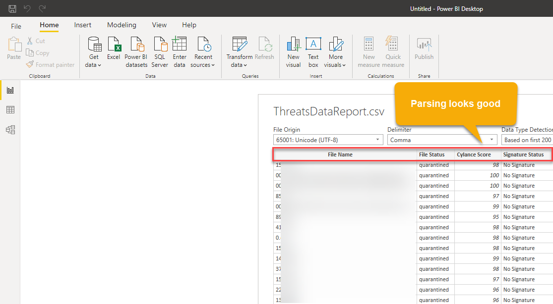
Power BI Desktop did a great job parsing the data in columns with the appropriate header. It even tries to detect the type of data such as string vs. number vs. date.

Figure 4:  Parsing of fields

Adjusting Fields

You should now see the fields on the right hand side of the canvas. Note that there may be some instances in which Power BI takes the liberty in summarizing your data--sometimes this is helpful and something it does not make sense to humans. This is understandable since it still takes a human to determine the context around various data fields. A good example is provided when Power BI Desktop tried to sum the BlackBerry/Cylance Protect scores which is of no real value to analysts.  "A" for effort though and at least it is correctable by clicking on the parsed field on the right > Column tools > Summarization > Don't summarize. 

Figure 5:  Adjusting the parsed fields

Don't worry about trying to find all of the misinterpreted data up front. You will discover some of these as we start creating visualizations in our report.

Note:  Power BI prefers Columnar data, thus spreadsheets that are appealing to the human eye are not always interpreted correctly by Power BI. This level of transforming and manipulating will be left to another article.

Visualizations

What may be most impressive about Power BI is the amount of visualizations available by default. These include (but are not limited to):

  • Area charts
  • Bar and column charts
  • Cards (numeric value)
  • Combo charts
  • Doughnut charts
  • Funnel charts
  • Guage charts
  • Key influencers chart
  • KPIs
  • Line charts
  • Maps (ArcGIS, filled choropleth, and shape)
  • Pie charts
  • Ribbon charts
  • Treemaps
Figure 6:  Visualization options


And the list goes on...  

To start with a simple visualization, let's create a card with the total number of events (in this case it will correlate to the number of rows we have... each row in our data always contains a DeviceName). Begin by clicking anywhere in the canvas and then click the card icon under visualizations. Drag the field you want to count to the Fields box under Visualizations (in our case it was DeviceName). Then click the down arrow and select Count. There are lots of formatting options by clicking on the paint roller under visualizations. We encourage you to explore those settings to achieve your desired look. 

Figure 7:  Created our first visualization - a card that contains the count of events

Saving Your Work

Now that you have ingested, parsed, and created your first visualization in your report, it is time to save it. Click File > Save As > Name the file. Notice that the file extension is .pbix. Feel free to close Power BI Desktop, re-open your file, and also notice that the data is still there. This indicates that the data is self-contained within the .pbix file -- keep this in mind where sharing your .pbix files with others.


Conclusion

In this article, we showed the different options for downloading and using Power BI. Specifically downloading Power BI Desktop and ingesting BlackBerry (Cylance) Protect Threat Data Report data which is in CSV format. Power BI Desktop parsed the data and we showed one potential alteration to the way the data was interpreted. Lastly, we rounded out the article showing how to create your first visualization and save your report locally as a .pbix file. Our follow-on articles will cover more advanced visualizations, relationships, filters, using reports, and uploading reports to Power BI Service (online). Thanks for reading, we hope you enjoyed this introduction to Microsoft's Power BI. Please feel free to leave feedback and your favorite Power BI features in the comments section below.

Wednesday, November 27, 2019

Making Splunk Dashboards Available Outside of Splunk

By Tony Lee

Have you ever built a beautiful Splunk dashboard that was not only aesthetically pleasing, but also incredibly insightful? If so, maybe others learned of its value and now want that data shared--even to users who may not have Splunk accounts. We had such a case in which the Chief Information Officer (CIO) wanted to add a particular Splunk panel to his intranet site for all employees to see. In this article we will recreate the scenario and show you how this can be accomplished. The two screenshots below show two possibilities of embedding Splunk panels into external sites.

Figure 1:  Example of  a single panel embedded into a page outside of Splunk

Figure 2:  Example of two panels embedded into a page outside of Splunk

Problem

There are quite a few issues that we need to solve, such as:
  • Splunk does not make it easy to share panels and especially entire dashboards outside of their platform
  • Some data may be sensitive in nature, so just remember the potential audience
    • Fortunately, this sharing can be disabled if needed
  • This solution needs to be long-term low maintenance which means no manual updates
  • The new website must be able to reach the Splunk search head via HTTPS

Potential Solution

The potential solution we are going to show uses scheduled saved reports to share out a panel. Here are the steps below:

1) Generate your insightful panel using the proper search.  Click Save As > Report

Figure 3:  Creating a report

2)  Select the content and time range selector

Figure 4:  Saving the report

3) After saving the report, let's schedule it

Figure 5: Schedule the report

4) Specify the schedule - this example updates the report every hour with the last hour of data

Figure 6:  Schedule parameters

5) Generate the embedded link by clicking Edit > Embed

Figure 7: Generating the embedded link

6)  Copy the embedded iframe link into the external site in question (Example site shown in Demo Page Code section below)

Figure 8:  Embedded iframe link

Conclusion

This is one possible solution that creates a low maintenance panel shared outside of Splunk. If you want to share an entire dashboard, this can be repeated for every panel in the dashboard. Just be cautious of the sensitivity of the data. If it is later determined that this data is no longer needed or should not be shared, it can be disabled. If you have a different method of sharing panels and especially entire dashboards, we would love to hear it.  Feel free to post it in the comment section below and as always happy Splunking.

Demo Page Code

This is just a demo page that contains two embedded saved reports.  The panel on the left is a single value number and the one on the right is a timechart.  Just remember to replace the two locations of:  "YOUR_EMBEDDED_LINK_HERE"


<HTML>
<HEAD>
<TITLE>This is an embedded demo</TITLE>
<style type="text/css">
<!--
td {
  height: 300px;
  vertical-align: center;
  text-align: center;
}
iframe {
  vertical-align: center;
  text-align: center;
}
-->
</style>
</HEAD>
<BODY>

<center><h2>CIO's Corner</h2></center>

<table style="width:100%" border=1>
  <tr>
    <th>Total Count</th>
    <th>Count over Time</th> 
  </tr>
  <tr>
    <td width="25%" height=300><iframe frameborder="0" scrolling="no" src="YOUR_EMBEDDED_LINK_HERE"></iframe></td>
    <td width="75%" height=300><iframe height="100%" width="100%" frameborder="0" scrolling="no" src="YOUR_EMBEDDED_LINK_HERE"></iframe></td>
  </tr>
</table>

</BODY>
</HTML>